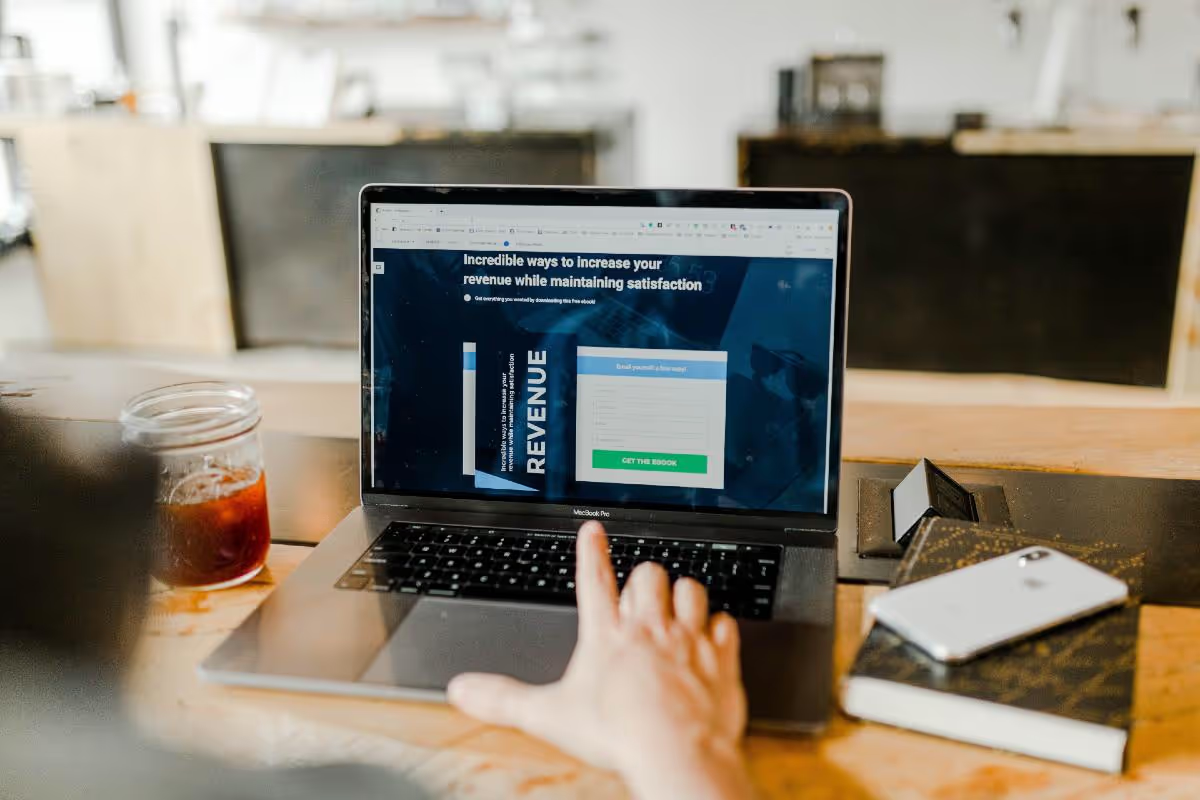
When we think of pop ups, we might think of the annoying ads that plagued our screens in the early ‘00s. Thankfully, we no longer see any of those in any search engine. However, pop ups have made a comeback on websites. It’s less intrusive and more personal. Fortunately, there’s the option to close the window, and if it’s enticing enough, we can receive promotional material and other goodies in exchange for our emails. It’s only worth it, though, if you have killer website pop up designs.
Here’s what you need to know in designing successful website pop ups. Plus, get inspiration from different case studies and examples.
What Makes a Successful Pop Up Design?
Sumo revealed that the conversion rate of any website pop up is 3.09%. And it can even go up to 50.2%! But what content or design should you include in a pop up design that yields those numbers?
Images
You’re missing out on potential customers or subscribers if your pop up designs lack images. The average conversion rate does go up from 3.09 to 3.80% if your pop up is more visual. Example images include high-quality product photography or custom illustrations. As an alternative, you can use stock photos, abstract graphics, and patterns as well.
Eye-Catching Typography
An alternative to images is eye-catching typography. Big letter blocks or calligraphy can certainly catch your visitor’s attention. Take it up a step further by making it bright (but not too bright). Since you have a small pop up space, don’t hesitate to make the typography pop out of the pop up designs.
Bright or Contrasting Colors
White is the default background for any pop up design. But you could make it aesthetically pleasing or attention-grabbing with bold and bright colors. Make sure that it’s not something that will burn or hurt your visitor’s eyes. Turning them away is the last thing you want them to do on your site.
On the other hand, you should also note contrasting colors for your pop up designs. For example, if your pop up design’s color scheme is blue, you could choose red, green, pink, or orange to make your CTA button or submit button stand out.
Simple or Minimalist
You don’t want to overload the visitor with so much information on the pop up design. After all, you have limited space on your pop ups and want to focus on promoting one thing at a time. Not only should it focus on one promotional matter, but the same goes when you want to acquire more email subscribers. You don’t want to add too many forms, which may prompt the visitor to close your pop up instead of signing up for it.
Time-Sensitive Messages
Evoke a sense of urgency and don’t let visitors, customers, or subscribers miss out on good deals and other items by adding a timer. It’s best to leave a space for it in the design process and then code it when you’re ready to publish it.
Examples of Pop Up Designs
1. Unbounce
A leader in conversion rate optimization, Unbounce also shows that they walk the talk and help others attain their conversion rate goals. They used exit intent pop ups for visitors. Design 1 was days before their event. Meanwhile, design 2 was published for their event.
For the first design, they used a gradient as a background. And even if the gradient had a slight tinge of orange, they used another shade of orange for the CTA, which can still grab your attention.
Meanwhile, the second design uses a photo and asymmetry. They used only green and blue as the main pop up colors, consistent with their microsite.
Results: Design 1 had a high conversion rate of 19.03%. Meanwhile, design 2 almost quadrupled that rate and reached a record of 67%.
2. Samsung
As outdated as this pop up design is, it’s still worth knowing how pop ups appeared a few years back. It focuses more on the hero image, the Samsung S6. Plus, without having to use any other colors, the CTA only uses a border. It’s one way not to put too much color in a pop up.
Results: There was a 7.6% clickthrough rate. And as an exit intent pop up, 60% of visitors stayed on the site rather than leave.
3. Hair Care Company Pop Up
Sometimes, the basics just work. What you can do is change the conventional pop up design to your advantage. Here’s one by a haircare company, which Zoronto worked on for their campaign. Their website pop up design was simple, use a photo of a model relating to your target audience, holding their products. And then use colors that reflect their brand. Plus, the colors are limited to the CTA and submit button.
Results: They increased their email list thanks to 12.3 thousand signups AND averaged a 17.3% conversion rate for their campaign. Not only that, but they earned $100,000 revenue.
4. Scrumbles
Giving cute animals attention is a way to leave visitors in awe. For Scrumbles’ case, they are at an advantage, considering they sell pet food. Their pop up designs use illustrations. Plus, the use of colors will entice users to read the pop up and check out what they’re offering. Not to mention, they also used visual hierarchy in both designs, ensuring the content and design is easy to follow.
Results: They achieved a 17.02% conversion rate from their campaign.
5. GNO Blanket
Meeting most of the criteria above, GNO Blanket has a pop up design you could use for your website. Although the pop up design doesn’t have bright or bold colors, they still stick to company colors. Aside from that, instead of using a blanket, they use a cat illustration looking snug as it sleeps. It’s a way to present their product without using high-quality and authentic photography.
6. Overlay Subscription News Example
Alternative to photographs or illustrations is textures or patterns. This pop up design example looks kaleidoscopic thanks to the different patterns. It will enthrall your visitors. Plus, it’s good to stick to a color scheme that won’t overwhelm your visitors, like how they did on the headline and submit button.
7. Pop Up Subscription Example
Here’s another take on the visual pop up design. Instead of letting your photo stick to the pop up borders, this one uses asymmetry to make the image pop. Even if the pop up doesn’t look bright, it’s still easy on the eyes because of the color scheme.
8. Outdoors Pop Up
Here’s one email pop up design that gives you an option on what content you want to receive before signing up. It’s one design to consider if you cover different topics or products. Even with the options to choose topics, it’s still organized and uses the elements of a successful pop up design, as mentioned above.
9. Sunglasses Email Sign Up Pop Up
A mix of both high-quality and original photography and pattern, this Sunglasses Email Pop Up is one worth looking to as inspiration. This will help glue visitors’ eyes to the pop up. Not only that, but it also follows visual hierarchy and uses contrasting colors (background and CTA button).
10. Pop Up Newsletter
Don’t settle for the traditional rectangle or square pop up. Give it some other shape, like this pop up newsletter. It looks like an envelope, with the CTA “Receive Newsletter.” This one’s straight to the point and creative enough to make someone sign up for a newsletter.
How to Get Your Own Pop Up Design
Conceptualizing your website pop up is one thing, but designing a pop up is a whole different story. You can use a pop up builder, which you could use when you’re ready for publishing.
But if you want a customized pop up design, you can hire a graphic designer or design service. They have the expertise and experience to ensure that your pop up will make visitors convert into your customers.
Luckily, we have options for you when it comes to design services, particularly unlimited graphic design services. Plus, we have big discounts for your first month of subscription to these design services. Check them out here now at Service List and get huge savings with unlimited graphic design services.


