TL;DR: Great eCommerce design can make or break your sales. The right banner and ad templates grab attention in seconds, guide customers toward purchase, and build trust instantly. We'll show you what works, what doesn't, and where to find templates that actually convert.
What makes effective eCommerce banner design?
Effective eCommerce banners use high-quality product images, clear headlines under 10 words, contrasting call-to-action buttons, and white space for readability. The best templates follow the F-pattern eye movement, placing key information where shoppers naturally look first. Mobile-responsive designs are essential since 60% of online shopping happens on phones.
Why Your eCommerce Design Matters More Than You Think
Your online store gets about 3 seconds to make an impression. That's it. If your banners and ads look cluttered, confusing, or unprofessional, people leave. When you're designing for ecommerce, every pixel counts because you're competing with thousands of other stores fighting for the same customer.
Good design isn't just about pretty pictures. It builds trust fast and makes the path to purchase crystal clear. The right banner tells customers what you sell, why they should care, and what to do next without making them hunt for answers.
What Makes Banner Templates Work
Size and placement matter more than you'd expect. Homepage hero banners typically work best at 1920x1080 pixels for desktop, while mobile banners need to be 640x960. Your template should adapt automatically, not just shrink down and become unreadable.
Color psychology plays a huge role. Red creates urgency (perfect for sales), blue builds trust (great for new brands), and green suggests eco-friendly or health products. Pick colors that match both your brand and the emotion you want to trigger.
Typography can't be an afterthought. Your headline font needs to be readable at a glance. Stick with sans-serif fonts like Montserrat or Roboto for headers, and keep body text between 16 and 18 pixels. If someone has to squint, you've already lost them.
The call-to-action button deserves special attention. "Shop Now" performs twice as well as vague phrases like "Learn More." Your CTA should contrast sharply with the background and be big enough to tap easily on mobile (minimum 44x44 pixels).
Images should tell your story instantly. Show your product being used, not floating on a white background. People buy emotionally and justify logically, so help them visualize owning what you're selling.
Where to Find Templates That Convert
Canva offers hundreds of free eCommerce templates you can customize without any design skills. Their editor makes it easy to match your brand colors and swap in your products.
Creative Market has premium templates starting at $10 that look professionally designed because they are. You get Photoshop and Figma files you can reuse forever.
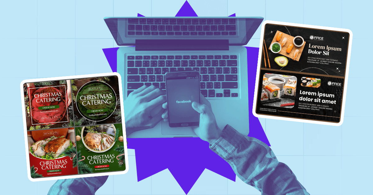
For ads specifically, Facebook Ads Library lets you see what's working for competitors right now. Search for brands in your niche and check which ad designs they're running repeatedly. If they keep running it, it's making money.
If you're running a startup and need consistent design quality without the overhead, on-demand graphic design services can deliver unlimited banner variations for a flat monthly rate. This works especially well when you're testing multiple designs across different channels.
Making Templates Your Own
Templates are starting points, not finish lines. The best results come from testing different versions. Try two headline variations, swap button colors, or change your product image. Run both versions for a week and keep whichever gets more clicks.
Remember that consistency builds recognition. Your banners, ads, and product pages should feel like they're from the same brand. When you're designing for ecommerce, use the same fonts, colors, and style across everything so customers know it's you. Creative support for startups often includes brand guidelines to keep everything cohesive across all your marketing materials.
Conclusion
Start designing smarter today. You don't need to be a designer to create banners that sell. The templates exist, and the rules are simple: clear message, strong visuals, obvious next step. Pick a template that fits your product, customize it to match your brand, and test what works with real customers. Your conversion rate will tell you everything you need to know.
Whether you're doing it yourself or working with the best design services, the key is getting started and staying consistent. Many successful stores started with simple banner templates and refined them based on real customer behavior.
Take Your Store to the Next Level
Ready to turn browsers into buyers? If you need professional designs that convert without the hassle of hiring full-time designers, Penji offers unlimited graphic design services perfect for eCommerce stores. See why startups choose us for all their design needs, from banners to product images to ad creatives.
Learn more about why Penji is the go-to solution for growing online stores, or explore our graphic design services for startups to find the perfect fit for your business.
Frequently Asked Questions
What size should eCommerce banners be? Desktop hero banners work best at 1920x1080 pixels, while mobile needs 640x960. Always design for mobile first since most shopping happens on phones now.
How many words should be on an eCommerce banner? Keep headlines under 10 words and body text under 20. People scan, they don't read. Every extra word chips away at your conversion rate.
Should I use photos or illustrations for eCommerce ads? Real product photos convert better for physical products. Illustrations work well for services or digital products where you're selling a concept rather than an object.
How often should I change my banner designs? Refresh promotional banners every 2 to 4 weeks to prevent banner blindness. Keep evergreen banners for 3 to 6 months unless performance drops.
.png)
.png)